Personalizing every fitness journey
Nautilus needed Bowflex to compete as a connected fitness brand, not just a hardware maker, and had no software team of its own to build one. I prototyped the early concept that helped Slalom land the engagement, then led interaction design for JRNY through launch, focused on how the experience responded to the hardware itself. The work shown here is mine; the lead visual designer covered other parts of the app, and engineering shipped it on iOS and Android.
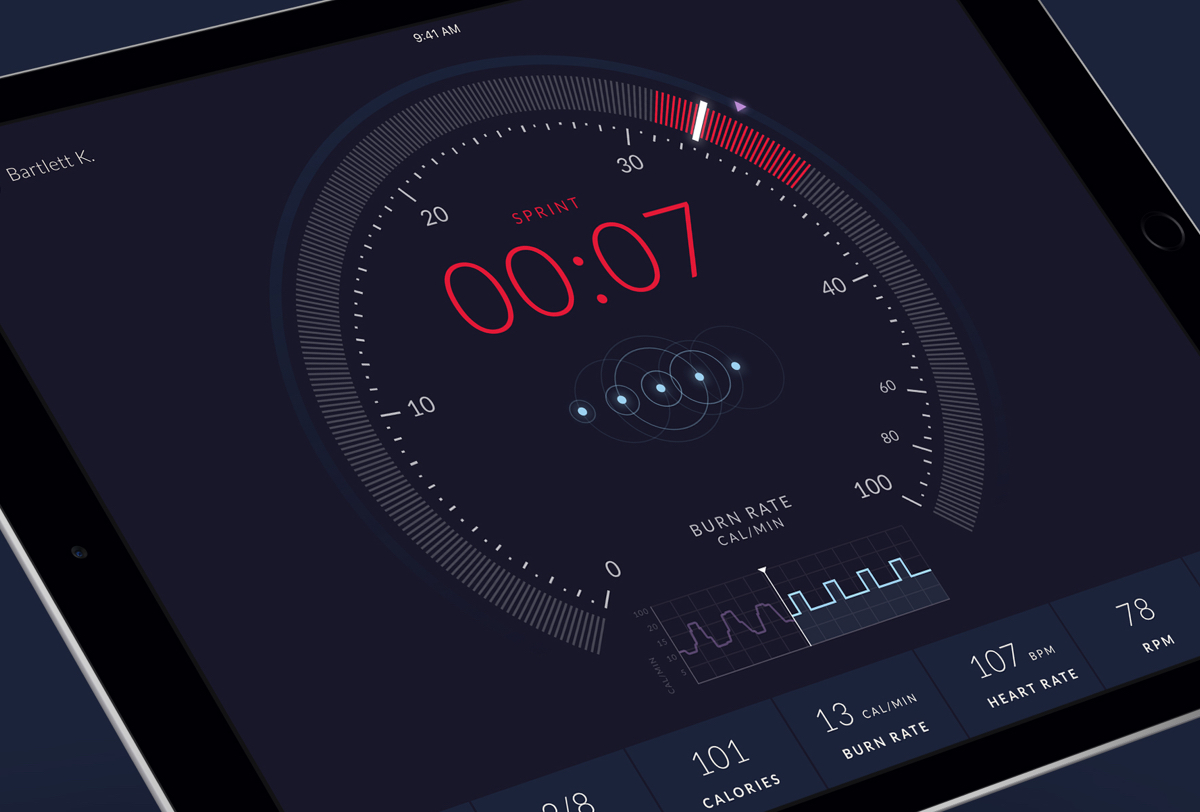
Every screen here follows the same idea: the app is an extension of the machine, not a separate product bolted on. Transitions, controls, and feedback all borrow from the Max Trainer's own console, so a workout feels driven by one continuous, considered system whether you're looking at the hardware or the phone.
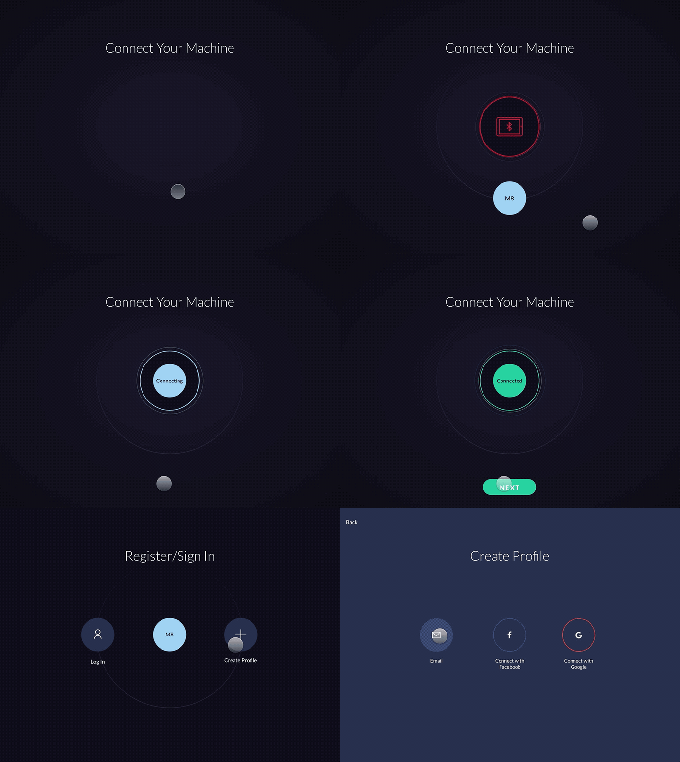
User Onboarding
The goal was to guide new customers through setup and registration while adding a bit of delight through the interactions along the way. I created the initial concepts, final design, and interaction specs for the onboarding flow.
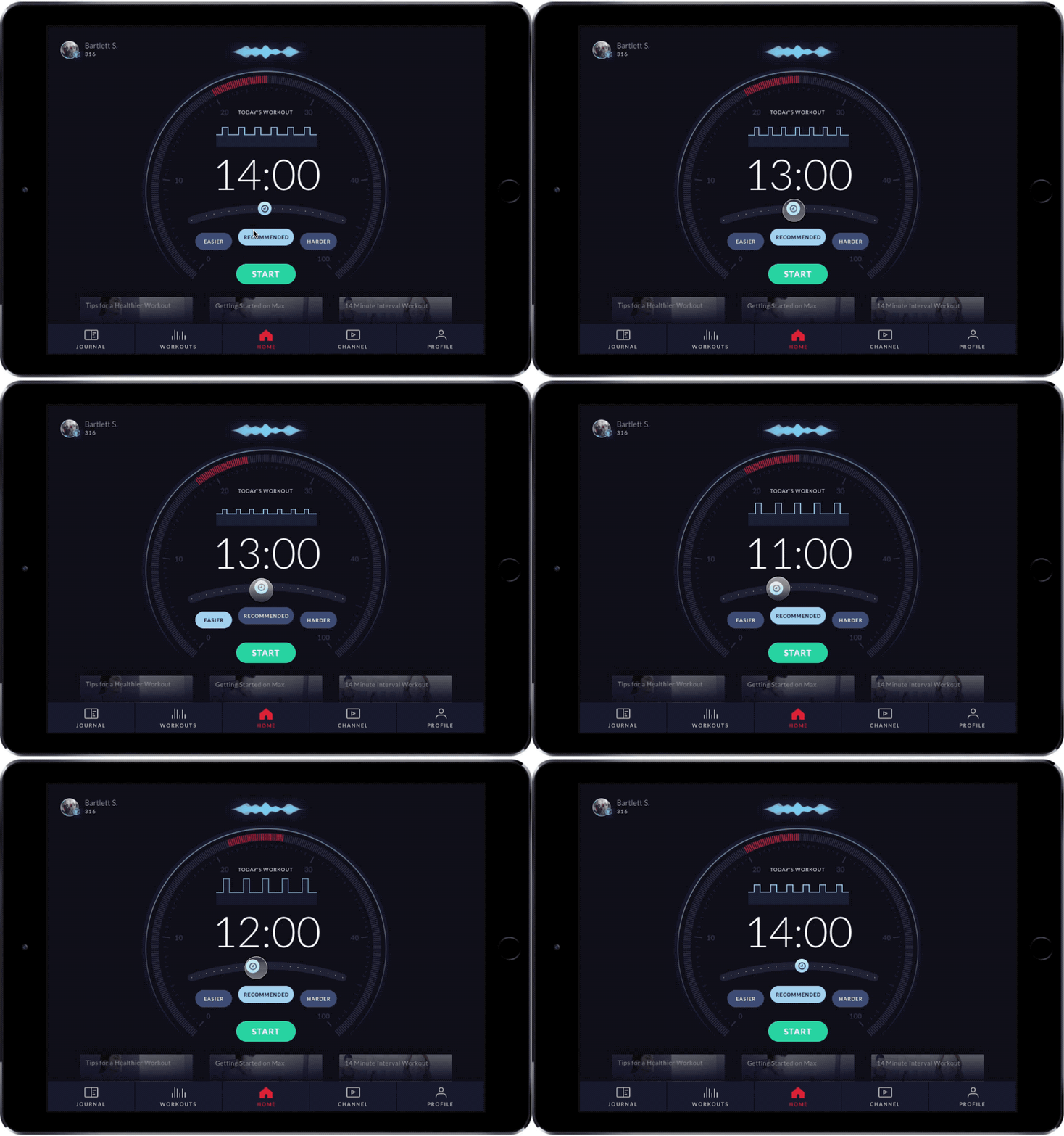
Workout Selection
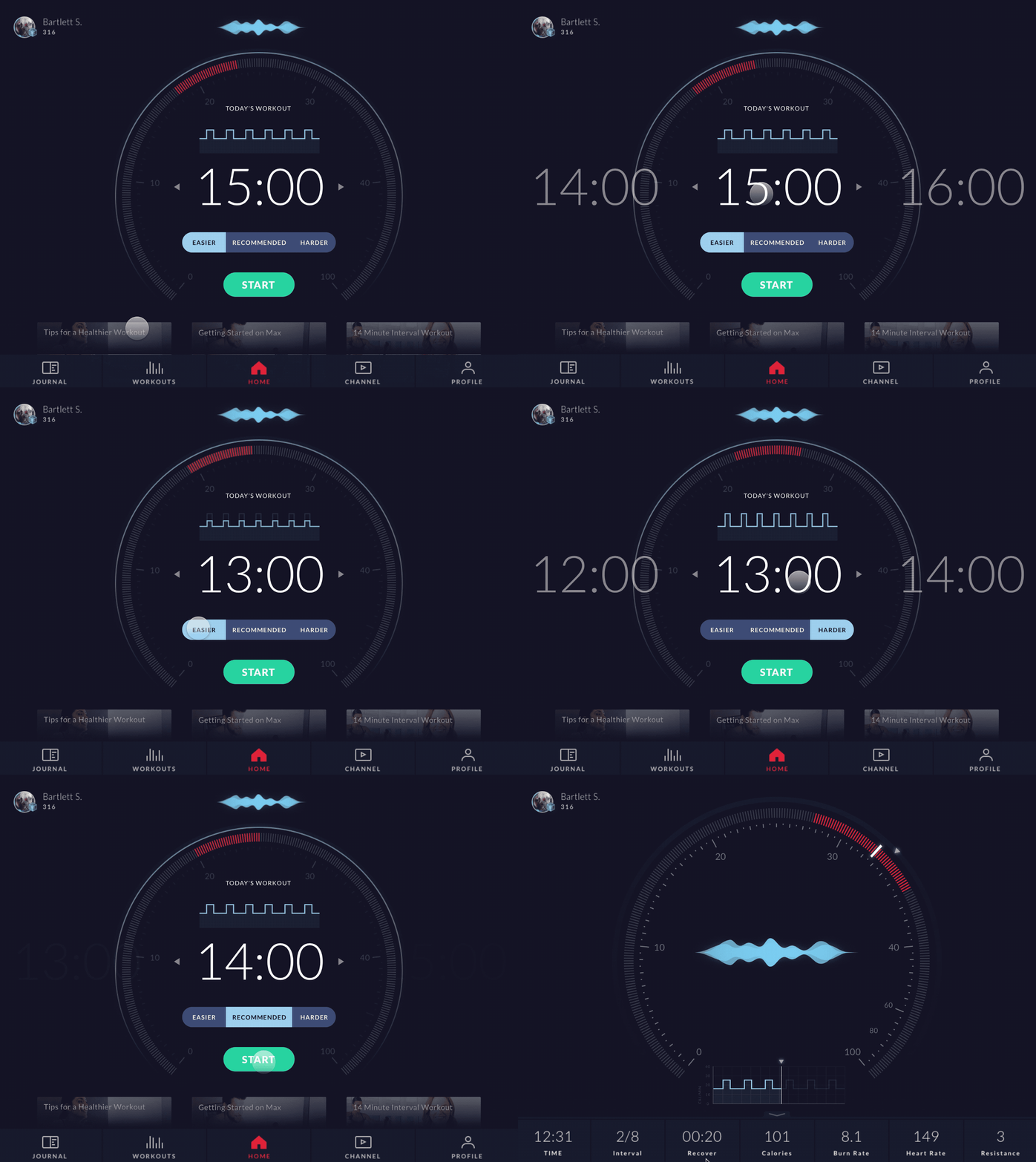
Taking inspiration from the existing Max Trainer hardware, I designed and developed multiple iterations of the workout selection home screen — built from scratch to emulate the physical interface that would otherwise be obscured once a device holder was in place.
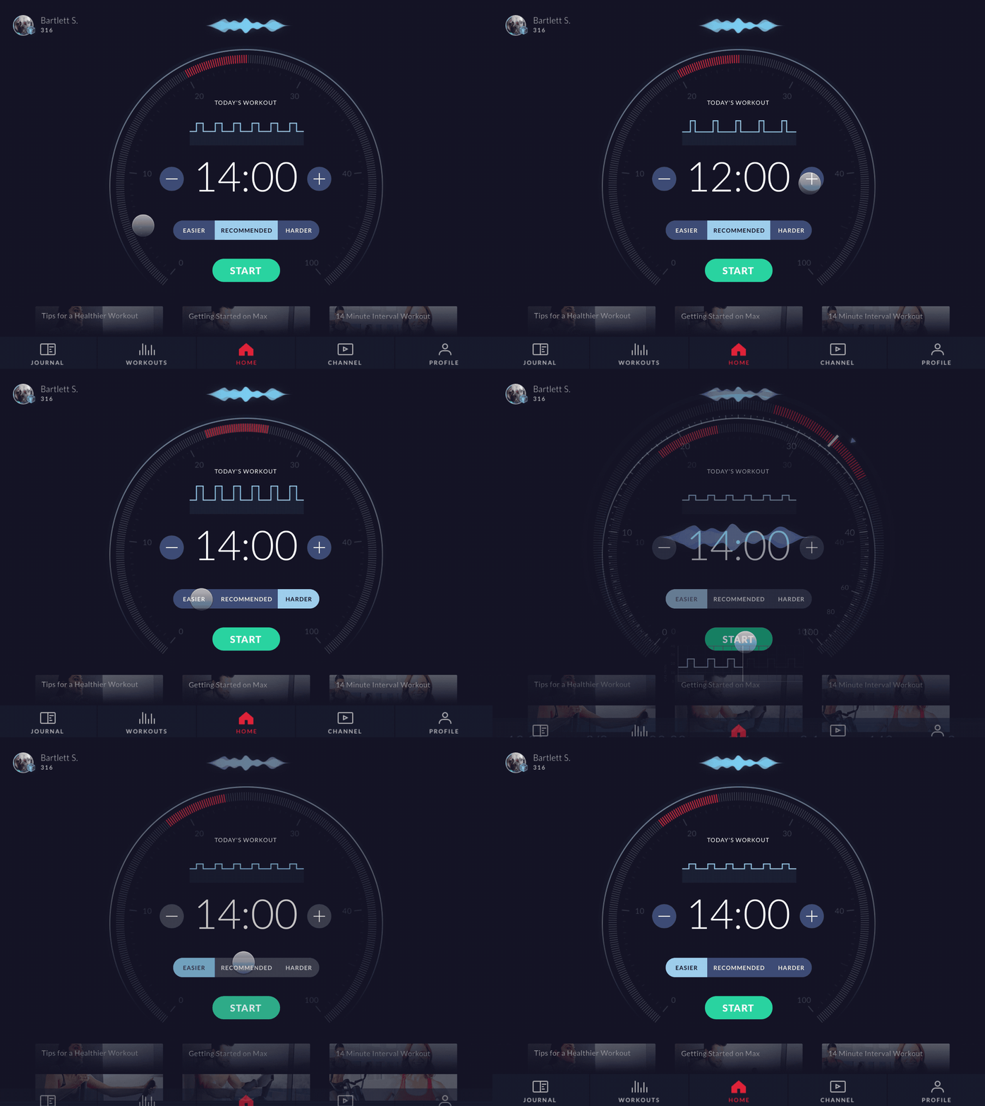
Tuning the Interaction Model
Across iterations, I explored how time and difficulty should tie into the interval and burn-rate visualizations, and tested a few distinct input models for adjusting a workout before starting it. Both versions went to Bowflex's UXR team for usability testing, and I folded feedback back into the work at each stage.

Home to Workout Animation
I took inspiration from the Max Trainer's physical display and modern car interfaces to explore how transitions could add a sense of delight while preparing customers for the workout ahead.
Device Connection
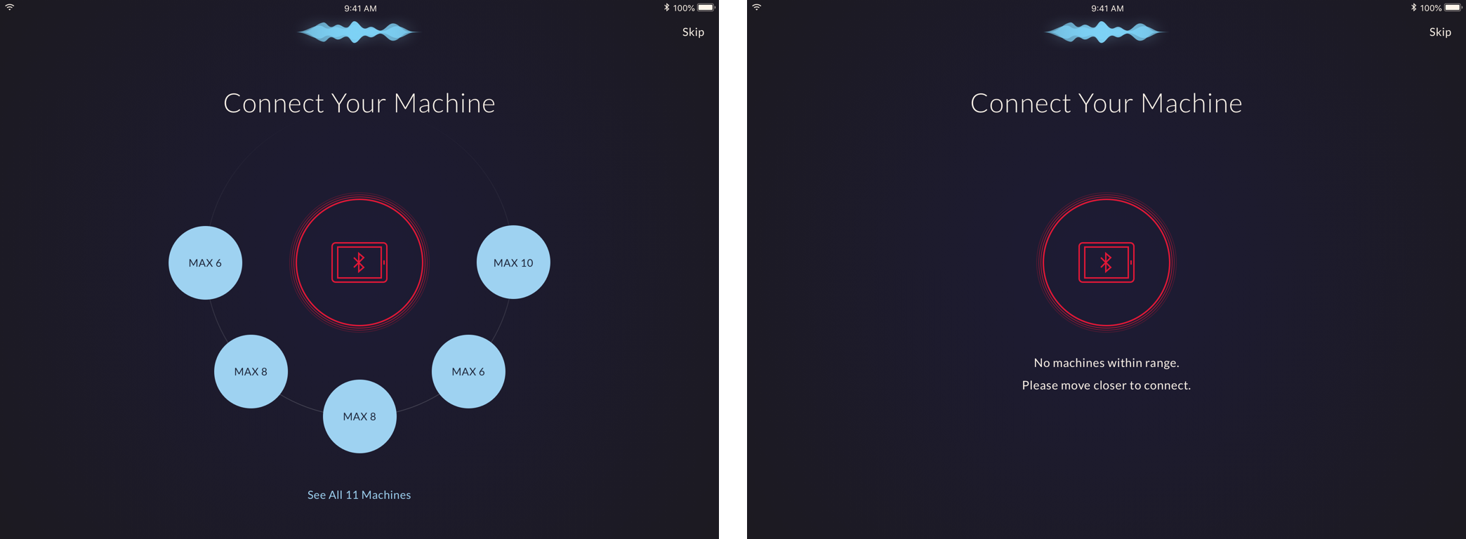
Connecting to the Max Trainer over Bluetooth is one of the first experiences a customer has with the app, and pairing two devices is a place people commonly run into friction. A patent held by another exercise company ruled out a wired connection, so rather than leave the experience to chance, we leaned into the challenge directly — with clear states for searching, connecting, and recovering from a failed pairing.
Workout Complete
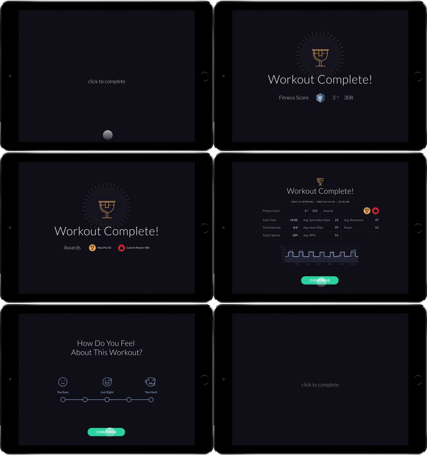
We wanted to motivate customers to keep coming back after a workout. Using a blend of Lottie animations and Framer, I brought some life into the results screen as customers reviewed their achievements and reflected on the session.
Impact
The JRNY app launched alongside the Max Trainer M6 and M8 as part of Bowflex's Black Friday 2018 product launch, on a fixed deadline I designed and specified against. My work on the project, and Slalom's broader engagement, wrapped in spring 2019 as the app moved into ongoing development with Bowflex's internal team.
By April 2019, more than 20,000 Max Intelligence–capable machines had been sold, running the interaction model and onboarding flow I'd designed for launch.
Reflection
This project asked me to move fluidly between exploratory prototyping and production-ready interaction specs — often on the same feature within the same week. Working from a physical machine's existing display and controls meant every digital decision had to respect a hardware experience customers already trusted.
The most durable lesson was in how much interaction detail compounds. Small choices — how a tachometer behaves mid-workout, how a device search resolves, how a results screen paces its reveal — are what make an app feel considered rather than assembled. Getting those details right took continuous testing with real customers, not just internal reviews.