Shaping the future of email to assist workers in reclaiming their time
I helped lead discovery, definition, and design of Echo, a new email platform meant to reimagine the core experience. In three months we turned research into a working alpha that treated email as a productivity tool, not just a mailbox. The team was two founders, one an engineer, plus a second engineer; I owned the interface experience end to end.
Stuck on the same old tracks
Email is the app people love to hate and cannot live without. Startups keep trying to “make email better,” but better has mostly meant a slicker inbox. The protocol that moves the freight is also what keeps the product from moving.
At Cloud City Labs we wanted modern SaaS capabilities with that protocol handled behind the scenes — so the product could reduce cognitive load instead of rearranging it. There had been no formal research when I joined. On a three-month clock I recruited power users: people who spent more than three hours a day in email, managed others, and felt email got in the way of the actual job.
Contextual interviews showed how they worked. A broader survey checked whether the pain was shared. Three How Might We questions focused the work:
- How might we improve the quality of a conversation so people can actually get work done?
- How might we speed up repetitive tasks and free time for other responsibilities?
- How might we create new ways to engage with service and marketing content?
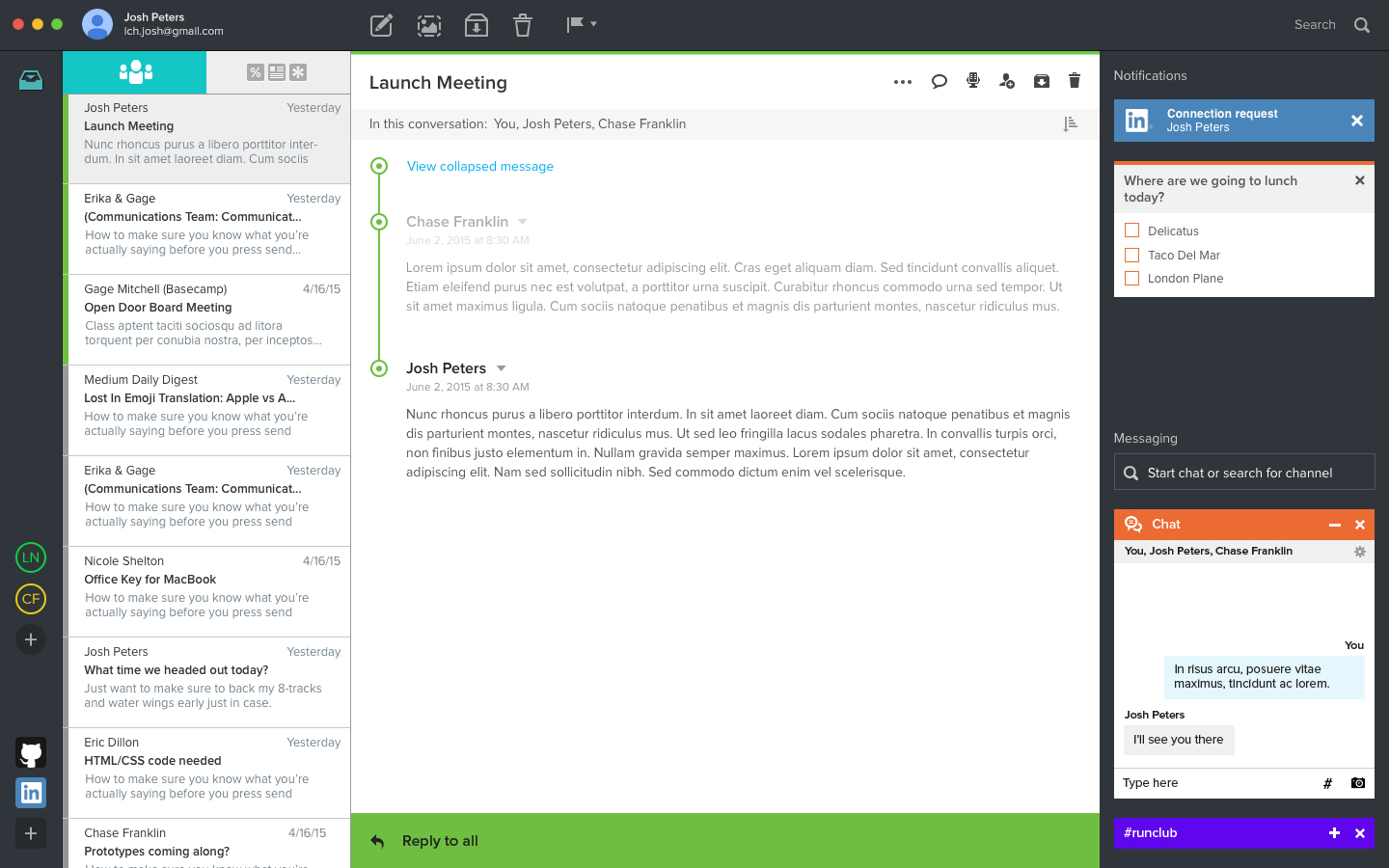
Every feature traces back to one idea: pull the actual work out of the reply chain. How a conversation reads, how you reply to it, and what email can do beyond text all move into a Companion object sitting beside the message, not buried inside it.
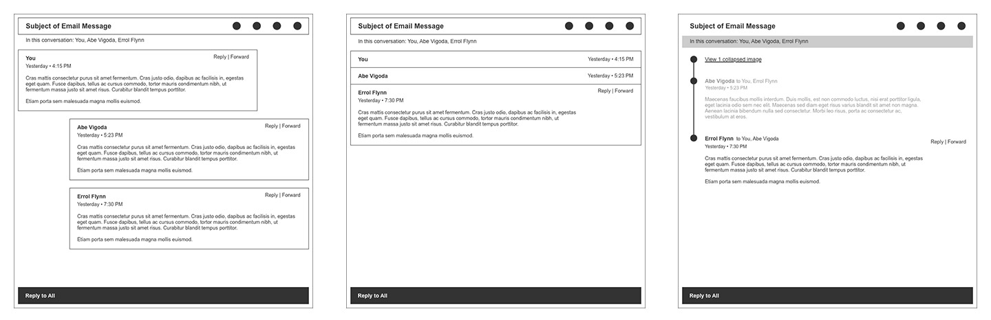
How a conversation should read
Block quotes bury the actual reply. People comment inside the quote, carry the whole history forward, and leave recipients to parse what matters.
Before designing features on top of a thread, I wired alternative structures — expanded cards, collapsed stacks, a timeline — so we could evaluate how a conversation should feel to read.
Reply with a comment
The pain was not “email is messy.” It was that the reply method itself created the mess. I proposed inline commenting so people could mark a specific line and leave the rest of the conversation readable.
Actionable cards
Notification mail all lands with the same weight, and almost none of it is truly actionable from the inbox.
I asked whether we could parse a category of those messages into a useful action and never ask someone to file the original. The card is the path to done.
Additional explorations
Beyond the core reading and reply model, we prototyped a wider set of bets on what a Companion object could do: making information from a thread retrievable without digging, cutting out repetitive manual work, and pulling outside content into the message instead of sending someone away from it.
Summaries and polls
A conversation summary made a shared file findable without reopening every message, surfacing what happened in the thread instead of an attachment icon that wouldn't work here. A poll took the idea further, living in the message and in the Companion, so answers collected in the sidebar instead of a string of “+1” replies.
Cutting repetitive busywork
Clips turned a support rep's Word doc of canned replies into reusable text, image, file, and web-view snippets inserted without leaving the message. A slash command did the same for scheduling, pulling free time from the calendar into the message instead of typing it from memory.
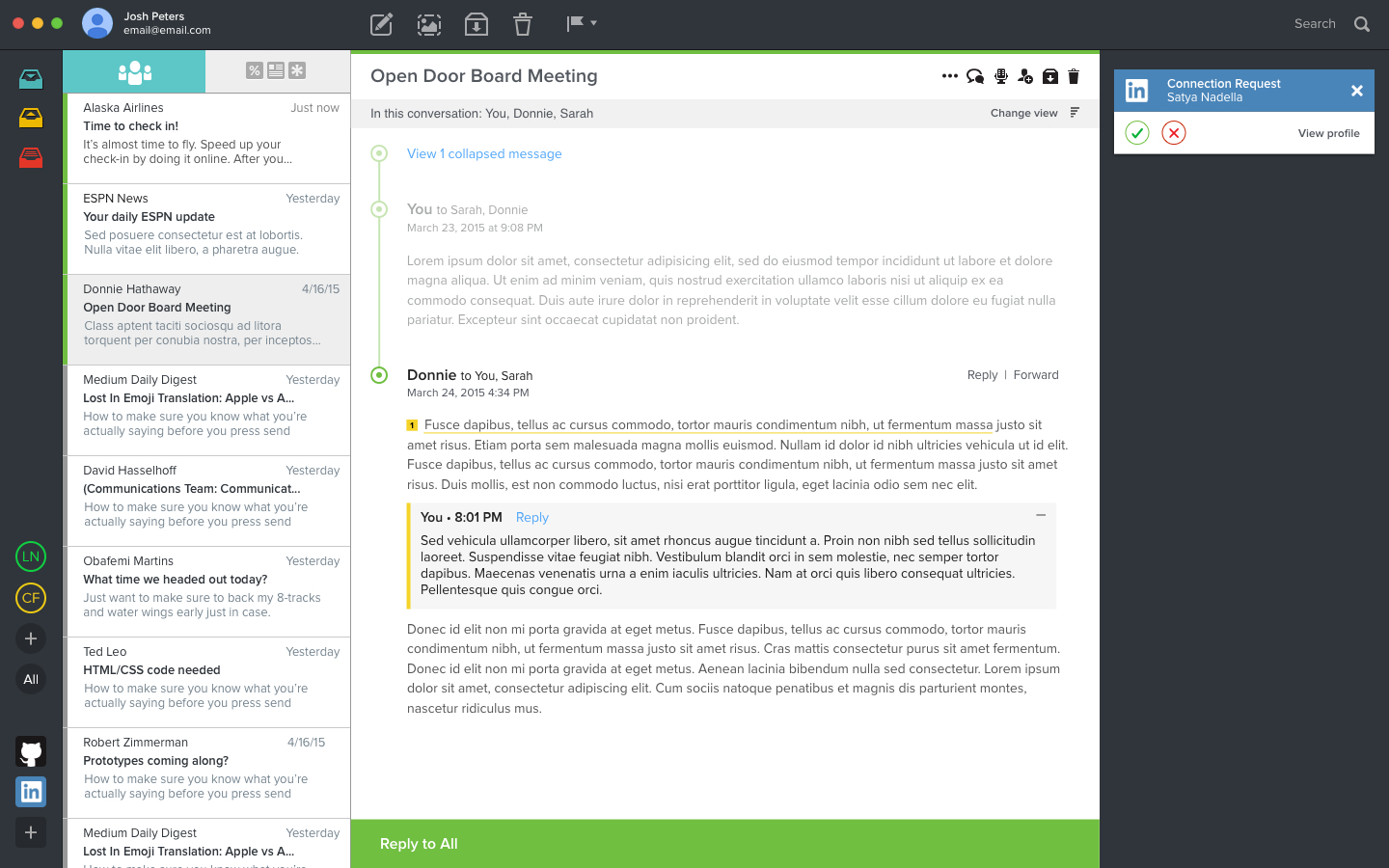
Bringing outside content into the message
A LinkedIn request or a live sports score could live in the Companion instead of pulling someone into another tab, testing how far email could carry interactive content without becoming a browser itself.
Impact
In three months we went from a concept to a working alpha, and the founders took it directly to investors.
We did not secure funding to continue.
Accomplishments
- Ran contextual interviews with email power users and a follow-up survey, then wrote How Might We questions that scoped the feature set.
- Defined and prototyped nine productivity concepts in Keynote for investor review, spanning conversation structure, repetitive-task automation, and outside content.
- Owned visual and interaction design at a baseline fidelity meant to sell the experience without over-investing in polish.
Reflection
The vision was right, but it ran into a wall design can't solve. Email's HTML format is decades old, and every client, Gmail and Outlook especially, renders it under its own rules. Tools like Slack or Asana own their entire client experience end to end; Echo would have needed heavy translation between providers to make some of this work at all, and parts of it stayed genuinely untenable. The lesson was knowing when an idea is fighting the platform underneath it, not just the market, and several of these concepts have since shown up in other tools, which suggests the direction was right even where the execution path wasn't.